
What button-card is and why people use it
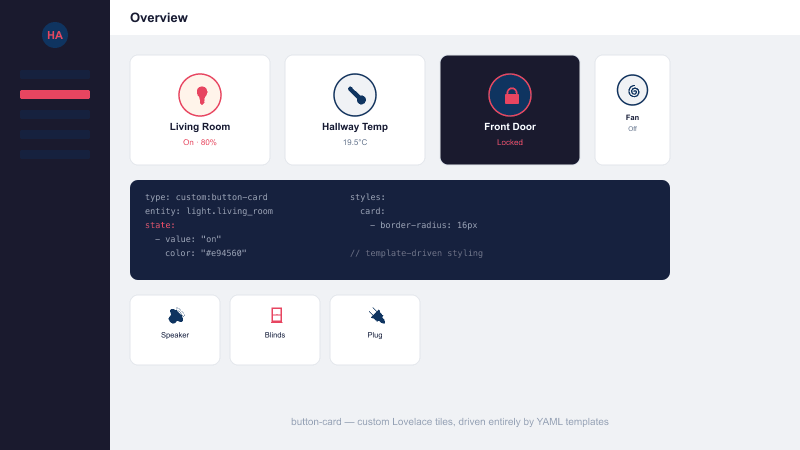
Where the built-in tile card offers a fixed set of layout choices, button-card treats almost every part of the tile — the icon, name, state text, label and the card background itself — as something you can style individually and make conditional on the entity's state. According to the project's own documentation, it supports separate tap, hold and double-tap actions (each of which can trigger a toggle, open the more-info dialog, navigate to another view, call a service, open a URL, or trigger Assist), an optional separate tap action just for the icon, momentary press/release actions, confirmation dialogs and PIN protection on sensitive actions, and haptic feedback on the iOS companion app. The trade-off is that it's entirely YAML-driven — there's no visual editor for the advanced features, so it suits people comfortable editing dashboard YAML directly rather than clicking through a UI editor.
Installing button-card via HACS
button-card is installed the same way as most Lovelace custom cards, through HACS (Home Assistant Community Store), which must already be set up on your instance:
- Open HACS from the Home Assistant sidebar.
- Go to the Frontend section and search for "button-card".
- Select the button-card repository and click Download.
- Restart Home Assistant, or reload the frontend resources, when prompted.
- Check Settings → Dashboards → Resources to confirm the card's JavaScript file was registered — HACS normally adds this automatically.
If it isn't showing up in a HACS search, it can also be added as a custom repository (three-dot menu in HACS → Custom repositories, category Lovelace) using the GitHub URL directly.
Core YAML options
A minimal button-card config just needs a type and an entity, and it will show a sensible default icon, name and state. From there, the documented options that come up most often include:
entity— the entity_id the card represents.name/show_name— override the displayed name, or hide it entirely.show_icon,show_state,show_label— toggle whether the icon, state text and an optional label line are shown.tap_action,hold_action,double_tap_action— each accepts anaction(e.g.toggle,more-info,navigate,call-service,url,assist) plus action-specific parameters.state— an array of conditions, each with anoperatorandvalueto match against the entity's state, plus thecolor,iconorstylesto apply when that condition is true. This is what lets a single card change appearance for "on", "off", "unavailable" and any custom state.styles— a set of card-specific CSS-like declarations, grouped under keys such ascard,img,name,state,iconandlabel, each accepting a list of property/value pairs (for example,border-radius,colororfont-size).color_type— controls whether state-based colouring applies to the icon or to the whole card background.size/aspect_ratio— adjust the icon size and the card's width-to-height ratio.confirmation— adds a confirmation prompt before an action fires, useful for anything destructive like unlocking a door.
button-card also supports reusable templates: a template is a named block of shared config (styles, actions, state rules) defined once and referenced from multiple card instances via a template key, so a whole dashboard of similarly styled buttons doesn't need the same YAML repeated on every card.
Example: a simple light toggle button
A straightforward button that shows a light's name and state, and toggles it on tap:
type: custom:button-card
entity: light.living_room
name: Living Room
show_state: true
tap_action:
  action: toggle
state:
  - value: "on"
    color: "#e94560"
  - value: "off"
    color: var(--disabled-text-color)
Here the state array is doing the visual work: when the light is on, the icon and name switch to an accent colour; when it's off, they fall back to a muted, disabled-looking tone.
Example: a templated multi-state button
A more advanced button that uses a shared template plus its own state and styles overrides for a lock entity:
# In a button_card_templates.yaml or templates section:
button_card_templates:
  secure_tile:
    show_name: true
    show_state: true
    styles:
      card:
        - border-radius: 12px
        - padding: 12px

# On the dashboard:
type: custom:button-card
template: secure_tile
entity: lock.front_door
tap_action:
  action: toggle
hold_action:
  action: more-info
confirmation:
  text: Are you sure you want to unlock the front door?
state:
  - value: "locked"
    icon: mdi:lock
    color: "#0f3460"
  - value: "unlocked"
    icon: mdi:lock-open-variant
    color: "#e94560"
This pulls the shared rounded-card styling from the secure_tile template, then adds entity-specific behaviour on top: a tap to toggle, a hold to open the more-info dialog, a confirmation prompt before unlocking, and different icons and colours for the locked and unlocked states.
button-card vs Mushroom Cards
The most common comparison is with Mushroom Cards, another popular HACS card pack. Mushroom is built around a family of domain-specific cards (light, climate, cover, and so on) that are fully configurable through Home Assistant's visual dashboard editor, with YAML only needed for its template card. button-card takes the opposite approach: one generic card type, configured almost entirely through YAML, with far deeper control over conditional styling in exchange for a steeper learning curve. Many dashboards use both — Mushroom for everyday entity tiles that don't need custom logic, and button-card for the handful of tiles where state-driven colours, icons or multi-action behaviour genuinely matter.
Common gotchas
Most button-card problems come down to a few recurring issues:
- YAML indentation. The
stateandstylesblocks are nested lists of key/value pairs, and a single misplaced space will either throw an editor error or silently fail to apply a style — always double-check indentation when copying examples. - Resource not registered. If a card shows "Custom element doesn't exist", check Settings → Dashboards → Resources for an entry pointing at button-card's JavaScript file, and add it manually if HACS didn't.
- Needing a restart or resource reload. After installing or updating via HACS, Home Assistant sometimes needs a full restart (or at minimum a frontend resource reload and browser hard-refresh) before a new card version takes effect.
- Templates not found. If a card referencing a
templatekey doesn't pick up the shared config, check that the template is defined in the right place (either in a dashboard's YAML underbutton_card_templates, or in a separate file referenced correctly) and that the template name matches exactly.
Because button-card only adds a frontend resource rather than integrations or automations, none of this affects the underlying Home Assistant configuration — the worst case is a dashboard tile falling back to an error card until the resource or YAML is fixed.