The Trading212 Home Assistant integration does the hard work of pulling your portfolio into HA as sensors. The Trading212 Lovelace card is what makes those sensors useful at a glance — a purpose-built dashboard card with auto-discovery, sparklines, and responsive layout that adapts to any Home Assistant theme. This guide walks through the full setup from HACS install to a finished portfolio dashboard.
Prerequisites
You need the Trading212 integration installed first. The card reads sensors that the integration creates — without them, there is nothing to display. Follow the Trading212 integration guide to get the sensors populating, then come back here. You will also need HACS installed to access the card.
Installing via HACS
The card is not yet in the default HACS catalogue, so you add it as a custom repository first — a one-time step that takes about 30 seconds.
- Open HACS → Frontend, then click the three-dot menu (⋮) in the top-right corner and choose Custom repositories.
- Paste
https://github.com/Smart-Home-Assistant-UK/lovelace-trading212-card, set Category to Plugin, and click Add. - Find Trading212 Lovelace Card in the HACS Frontend list and click Download.
- Reload your browser tab.
- Go to any dashboard, click Add Card, search for investment, and your five new card types appear.
The five card types
Each card serves a different part of your portfolio view. You can use them individually or combine them on a single dashboard.
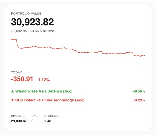
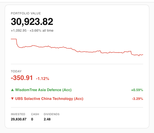
Health card
The best card to start with. It shows your total portfolio value alongside a 7-day sparkline drawn from the HA recorder, today's pound and percentage P&L, and your top and bottom daily movers. Zero YAML needed:
type: custom:investment-health-cardThe sparkline builds up over the first week as HA accumulates history from the integration's polls (default every 60 seconds).
Portfolio card
The all-in-one option. Combines the account overview, a scrollable positions list, and a pies list in one card. Ideal if you want a single-card dashboard view:
type: custom:investment-portfolio-cardYou can hide sections you do not need:
type: custom:investment-portfolio-card
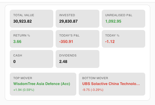
show_pies: falseOverview card
Shows the account stat grid and daily movers without any positions or pies. Good as a compact summary at the top of a more detailed dashboard:
type: custom:investment-overview-cardPositions card
A scrollable list of every open position with its value, P&L, return percentage, and a mini sparkline for each instrument. The list grows automatically as you open new positions — no config changes needed:
type: custom:investment-positions-card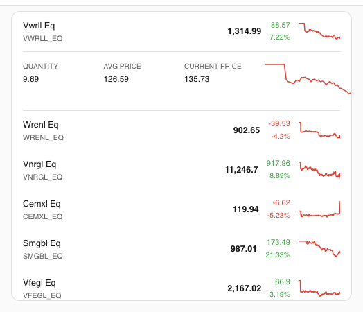
Pies card
Tracks your Trading212 pies with value, P&L, goal progress, and a dividend breakdown per pie. Also auto-discovers new pies without requiring config changes:
type: custom:investment-pies-card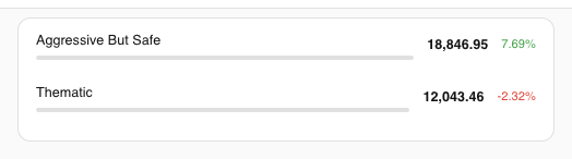
Configuration
Most users never need to touch the configuration — the cards auto-discover sensors using the default prefix sensor.trading212_. The only time you need to set options is if you have changed the integration's entity prefix or want to constrain the Portfolio card's layout.
| Option | Default | Cards | Description |
|---|---|---|---|
prefix | sensor.trading212_ | All | Sensor prefix for auto-discovery |
max_height | 400px | Positions, Pies | Max height before the list scrolls |
show_overview | true | Portfolio | Show/hide the overview section |
show_positions | true | Portfolio | Show/hide positions |
show_pies | true | Portfolio | Show/hide pies |
Recommended dashboard layout
A clean portfolio dashboard uses three sections. Create a new dashboard in Settings → Dashboards → Add Dashboard (icon: mdi:chart-line), then lay it out as follows:
- Top row: Health card (full width) — gives you value, sparkline, and daily P&L at a glance.
- Middle row: Positions card (left, ~60% width) and Pies card (right, ~40% width) — side-by-side on desktop, stacked on mobile.
- Optional bottom row: A mini-graph-card pointing at
sensor.trading212_total_valuewithhours_to_show: 720for a 30-day portfolio chart. See the dashboard automation guide for the full YAML.
On mobile the cards stack automatically and the scrollable lists have max_height: 400px so the page stays navigable.
Theming
The card uses Home Assistant's CSS custom properties throughout — it reads --primary-color, --card-background-color, and related variables automatically. Switch HA themes and the card adapts without any changes. The iOS dark theme available from HACS looks particularly clean with the sparklines.
Sparkline colours follow P&L sign: positive values render in green (or your theme's success colour), negative in red (or your theme's error colour). This is automatic and cannot be overridden per card.
Notes and caveats
Sparklines need history. The 7-day trend on the Health card and per-position mini-graphs draw from the HA recorder database. After a fresh integration install, you will see a flat or short line until enough poll cycles have accumulated — usually a day or two of data before the chart looks meaningful.
Read-only. Like the integration itself, the card only displays data. It cannot place, cancel, or modify orders on your behalf.
Auto-discovery relies on the entity prefix. If you have customised your integration's entity IDs via the entity registry, set the prefix option to match. The default sensor.trading212_ covers the standard install with no changes.