
What conditional visibility actually does
Every condition in Home Assistant's dashboard system evaluates continuously against live entity state. When the condition is true, the card is rendered; when it's false, the card simply isn't shown — it isn't greyed out or disabled, it disappears from the layout entirely. That matters for keeping a dashboard compact: a hidden card takes up no space, so the cards around it reflow to fill the gap.
Both the Conditional Card and per-card visibility rules share exactly the same set of condition types, so anything you can do with one you can do with the other — the choice is really about which produces cleaner YAML for your layout.
The Conditional Card
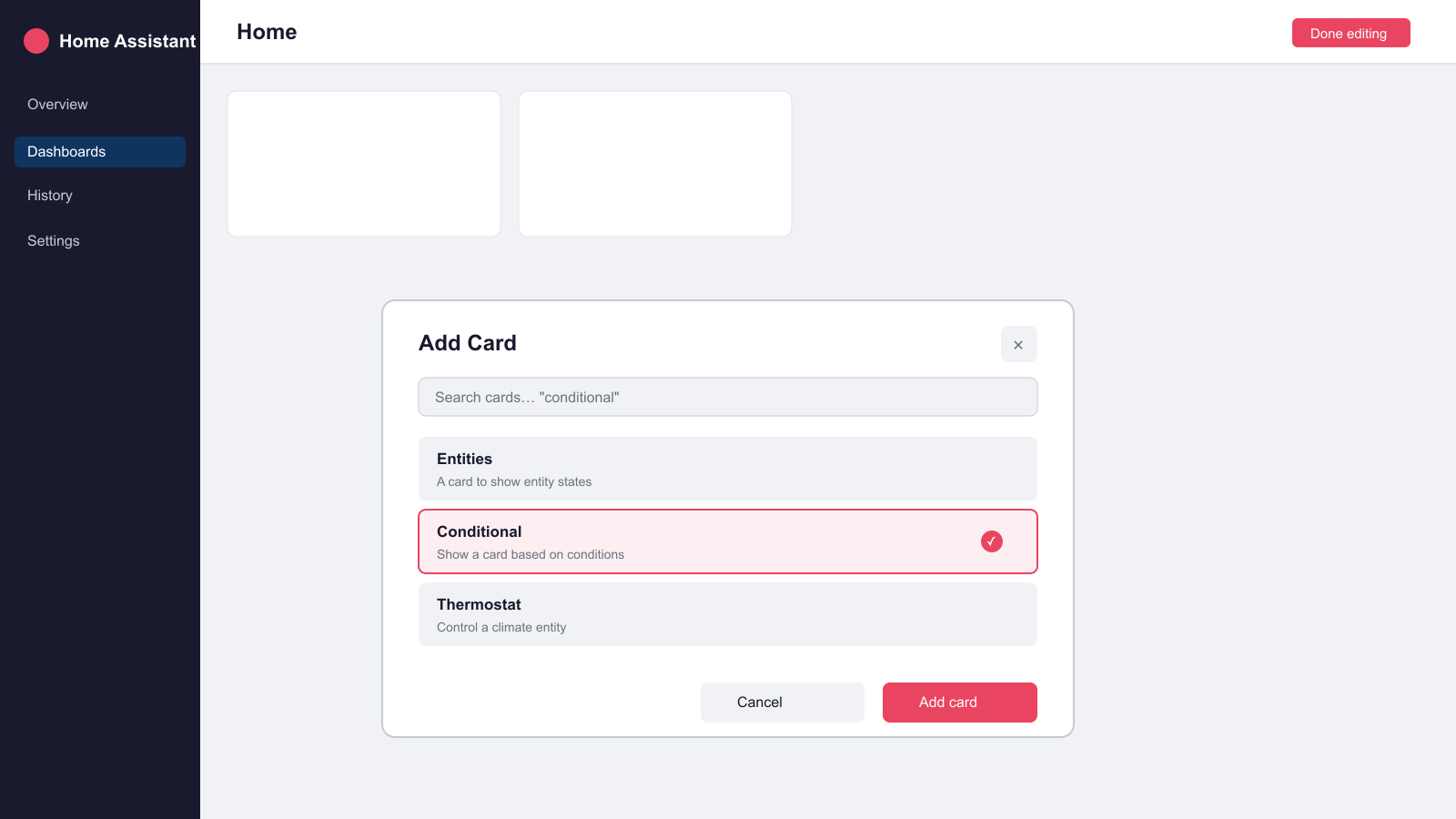
The Conditional Card is the original mechanism and still the right choice when you want to wrap a card that's defined elsewhere or reuse the same condition across several cards in a stack. It takes a list of conditions and a single card to render when they're all true:
type: conditional
conditions:
  - condition: state
    entity: climate.living_room
    state_not: "off"
card:
  type: thermostat
  entity: climate.living_room
That example hides a thermostat card entirely whenever the climate entity is switched off, rather than showing an inactive control that just wastes space. Multiple entries in conditions are combined with AND logic — every condition must pass for the card to appear.
Per-card visibility (the Visibility tab)
More recent Home Assistant releases let you attach the same condition logic straight to a card's own configuration under a visibility key, instead of wrapping it in a separate Conditional Card. In the dashboard editor this appears as a Visibility tab on the card's edit dialog; in YAML it looks like this:
type: entities
title: Kitchen
entities:
  - light.kitchen_lights
  - sensor.kitchen_temperature
visibility:
  - condition: state
    entity: person.paul
    state: home
The card above only renders while person.paul is home. Functionally this is identical to wrapping the same entities card in a Conditional Card — the difference is one less level of YAML nesting, which makes it easier to read once a dashboard has more than a handful of conditional cards. The same visibility key also works on view sections in the newer sections-based dashboard layout, so you can hide a whole group of cards at once rather than one at a time.
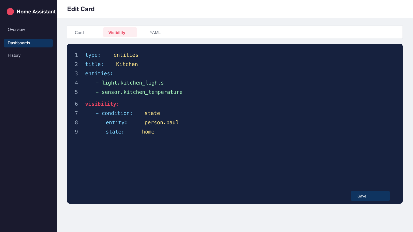
visibility block attached directly to a card, no Conditional Card wrapper needed.Editor caveat: while you're actively editing a dashboard, cards with visibility conditions are always shown so you can still find and edit them — you need to exit edit mode to see the real, conditional result.
Condition types you can use
Both the Conditional Card and the visibility key accept the same condition types:
- State — compares an entity's state to a value, using
state(must equal) orstate_not(must not equal). - Numeric state — compares a numeric entity to an
aboveand/orbelowthreshold, useful for sensor values like temperature or humidity. - Screen — shows or hides a card based on a CSS media query, so you can build layouts that differ between phone and wall-mounted tablet.
- User — restricts a card to specific Home Assistant users, handy for keeping admin-only controls off a shared kitchen tablet.
- Location — shows a card based on the current user's associated
personentity and zone. - Time — shows a card only between an
afterandbeforetime, optionally restricted to certainweekdays. - And / Or / Not — logical operators that let you nest and combine any of the above conditions.
An or block is useful whenever any one of several sensors should trigger the same card, such as showing a single alert card if either a smoke or CO alarm is active:
type: conditional
conditions:
  - condition: or
    conditions:
      - condition: state
        entity: binary_sensor.smoke_alarm
        state: "on"
      - condition: state
        entity: binary_sensor.co_alarm
        state: "on"
card:
  type: entities
  entities:
    - binary_sensor.smoke_alarm
    - binary_sensor.co_alarm
Common use cases
Hide a climate card unless someone's away. Pair a state condition on a person or presence entity with your heating card so an away-mode summary only appears when it's relevant, keeping the main dashboard focused on live controls.
Show an alert banner only when triggered. Wrap a markdown or alert-style card in a Conditional Card tied to a binary_sensor, so warnings about an open door, a low battery, or a leak sensor only take up space when there's actually something to act on.
Context-sensitive controls. An EV charging card that only appears while the car is plugged in, or a washing-machine progress card that only shows mid-cycle, both use the same pattern: a state condition on the entity that defines whether the card is currently useful.
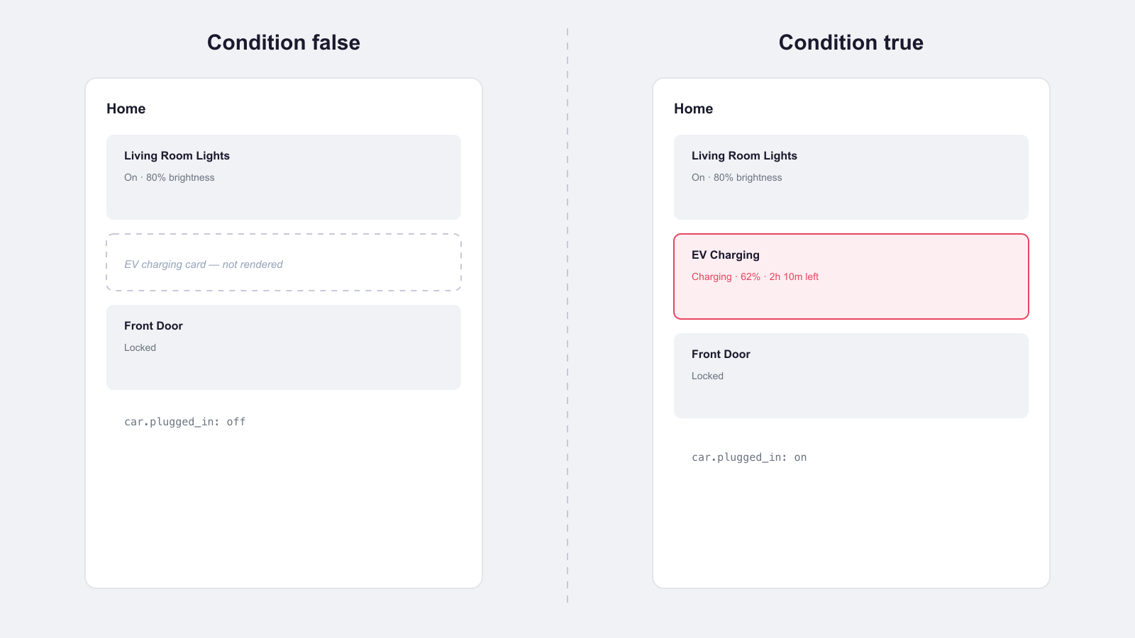
car.plugged_in is off, and reflows into view once the condition is true.Different layouts per device. A screen condition with a min-width media query lets a wall-mounted tablet show a denser, multi-column view while phones get a simplified single-column stack of the same underlying cards.
Practical tips
- Use it sparingly on critical controls. Hiding a card entirely can make a dashboard feel broken if the underlying entity goes unavailable rather than genuinely off — for safety-critical entities, consider dimming or greying out via a template instead of hiding completely.
- Prefer the Visibility tab for single cards. If you're only conditionally showing one card and don't need to reuse the condition elsewhere, the
visibilitykey keeps the YAML flatter than a Conditional Card wrapper. - Reach for the Conditional Card when reusing conditions. If several different card types in a stack need to react to the same condition, wrapping each in its own Conditional Card (or grouping them inside one) keeps the logic in one place.
- Test outside edit mode. Because the dashboard editor always shows conditional cards while you're editing, save your changes and exit edit mode before judging whether a condition is working as expected.
Conditional visibility pairs naturally with the wider dashboard layout choices covered in our Lovelace dashboard guide, and with custom card types like the ones in our button-card setup guide, where conditional styling and conditional visibility often get combined on the same tile.